Welcome to ShenZhenJia Knowledge Sharing Community for programmer and developer-Open, Learning and Share
menu search
person
Welcome To Ask or Share your Answers For Others

Categories

I found this example of how to make a responsive card deck using alpha 6 but it doesn't seem to work in the current beta 2. Does anybody know how to get it working in beta 2?

What I need is a responsive card deck that looks like this. enter image description here

The images can have varying sizes, I have no control over that. I would like the image height fixed to 100 px and the images to resize without distortion. The body height should scale to the body text and the row should take the height of the largest cell. So basically it should look like the image above but with cropped images.

Edit: This is the exact code I'm using:

<!DOCTYPE html>
<html lang="en">

  <head>

    <meta charset="utf-8">
    <meta name="viewport" content="width=device-width, initial-scale=1, shrink-to-fit=no">

    <link rel="stylesheet" href="https://maxcdn.bootstrapcdn.com/bootstrap/4.0.0-beta.2/css/bootstrap.min.css" integrity="sha384-PsH8R72JQ3SOdhVi3uxftmaW6Vc51MKb0q5P2rRUpPvrszuE4W1povHYgTpBfshb" crossorigin="anonymous">

    <script src="https://code.jquery.com/jquery-3.2.1.slim.min.js" integrity="sha384-KJ3o2DKtIkvYIK3UENzmM7KCkRr/rE9/Qpg6aAZGJwFDMVNA/GpGFF93hXpG5KkN" crossorigin="anonymous"></script>
    <script src="https://cdnjs.cloudflare.com/ajax/libs/popper.js/1.12.3/umd/popper.min.js" integrity="sha384-vFJXuSJphROIrBnz7yo7oB41mKfc8JzQZiCq4NCceLEaO4IHwicKwpJf9c9IpFgh" crossorigin="anonymous"></script>
    <script src="https://maxcdn.bootstrapcdn.com/bootstrap/4.0.0-beta.2/js/bootstrap.min.js" integrity="sha384-alpBpkh1PFOepccYVYDB4do5UnbKysX5WZXm3XxPqe5iKTfUKjNkCk9SaVuEZflJ" crossorigin="anonymous"></script>
    <script src="https://cdn.steemjs.com/lib/latest/steem.min.js"></script>


  </head>

  <body>
      <div class="container">
          <div class="card-deck">
              <div class="card mb-4">
                  <img class="card-img-top img-fluid" src="//placehold.it/500x280" alt="Card image cap">
                  <div class="card-block">
                      <h4 class="card-title">1 Card title</h4>
                      <p class="card-text">This is a longer card with supporting text below as a natural lead-in to additional content. This content is a little bit longer.</p>
                      <p class="card-text"><small class="text-muted">Last updated 3 mins ago</small></p>
                  </div>
              </div>
              <div class="card mb-4">
                  <img class="card-img-top img-fluid" src="//placehold.it/500x280" alt="Card image cap">
                  <div class="card-block">
                      <h4 class="card-title">2 Card title</h4>
                      <p class="card-text">This is a longer card with supporting text below as a natural lead-in to additional content. This content is a little bit longer.</p>
                      <p class="card-text"><small class="text-muted">Last updated 3 mins ago</small></p>
                  </div>
              </div>
              <div class="w-100 hidden-xs-down hidden-md-up"><!-- wrap every 2 on sm--></div>
              <div class="card mb-4">
                  <img class="card-img-top img-fluid" src="//placehold.it/500x280" alt="Card image cap">
                  <div class="card-block">
                      <h4 class="card-title">3 Card title</h4>
                      <p class="card-text">This is a longer card with supporting text below as a natural lead-in to additional content. This content is a little bit longer.</p>
                      <p class="card-text"><small class="text-muted">Last updated 3 mins ago</small></p>
                  </div>
              </div>
              <div class="w-100 hidden-sm-down hidden-lg-up"><!-- wrap every 3 on md--></div>
              <div class="card mb-4">
                  <img class="card-img-top img-fluid" src="//placehold.it/500x280" alt="Card image cap">
                  <div class="card-block">
                      <h4 class="card-title">4 Card title</h4>
                      <p class="card-text">This is a longer card with supporting text below as a natural lead-in to additional content. This content is a little bit longer.</p>
                      <p class="card-text"><small class="text-muted">Last updated 3 mins ago</small></p>
                  </div>
              </div>
              <div class="w-100 hidden-xs-down hidden-md-up"><!-- wrap every 2 on sm--></div>
              <div class="w-100 hidden-md-down hidden-xl-up"><!-- wrap every 4 on lg--></div>
              <div class="card mb-4">
                  <img class="card-img-top img-fluid" src="//placehold.it/500x280" alt="Card image cap">
                  <div class="card-block">
                      <h4 class="card-title">5 Card title</h4>
                      <p class="card-text">This is a longer card with supporting text below as a natural lead-in to additional content. This content is a little bit longer.</p>
                      <p class="card-text"><small class="text-muted">Last updated 3 mins ago</small></p>
                  </div>
              </div>
              <div class="w-100 hidden-lg-down"><!-- wrap every 5 on xl--></div>
              <div class="card mb-4">
                  <img class="card-img-top img-fluid" src="//placehold.it/500x300" alt="Card image cap">
                  <div class="card-block">
                      <h4 class="card-title">6 Card title</h4>
                      <p class="card-text">This card has supporting text below as a natural lead-in to additional content.</p>
                      <p class="card-text"><small class="text-muted">Last updated 3 mins ago</small></p>
                  </div>
              </div>
              <div class="w-100 hidden-xs-down hidden-md-up"><!-- wrap every 2 on sm--></div>
              <div class="w-100 hidden-sm-down hidden-lg-up"><!-- wrap every 3 on md--></div>
              <div class="card mb-4">
                  <img class="card-img-top img-fluid" src="//placehold.it/500x270" alt="Card image cap">
                  <div class="card-block">
                      <h4 class="card-title">7 Card title</h4>
                      <p class="card-text">This is a wider card with supporting text below as a natural lead-in to additional content. This card has even longer content than the first to show that equal height action.</p>
                      <p class="card-text"><small class="text-muted">Last updated 3 mins ago</small></p>
                  </div>
              </div>
              <div class="card mb-4">
                  <img class="card-img-top img-fluid" src="//placehold.it/500x300" alt="Card image cap">
                  <div class="card-block">
                      <h4 class="card-title">8 Card title</h4>
                      <p class="card-text">This card has supporting text below as a natural lead-in to additional content.</p>
                      <p class="card-text"><small class="text-muted">Last updated 3 mins ago</small></p>
                  </div>
              </div>
              <div class="w-100 hidden-xs-down hidden-md-up"><!-- wrap every 2 on sm--></div>
              <div class="w-100 hidden-md-down hidden-xl-up"><!-- wrap every 4 on lg--></div>
              <div class="card mb-4">
                  <img class="card-img-top img-fluid" src="//placehold.it/500x270" alt="Card image cap">
                  <div class="card-block">
                      <h4 class="card-title">Card title</h4>
                      <p class="card-text">This is a wider card with supporting text below as a natural lead-in to additional content. This card has even longer content than the first to show that equal height action.</p>
                      <p class="card-text"><small class="text-muted">Last updated 3 mins ago</small></p>
                  </div>
              </div>
              <div class="w-100 hidden-sm-down hidden-lg-up"><!-- wrap every 3 on md--></div>
              <div class="card mb-4">
                  <img class="card-img-top img-fluid" src="//placehold.it/500x270" alt="Card image cap">
                  <div class="card-block">
                      <h4 class="card-title">10 Card title</h4>
                      <p class="card-text">This is a wider card with supporting text below as a natural lead-in to additional content. This card has even longer content than the first to show that equal height action.</p>
                      <p class="card-text"><small class="text-muted">Last updated 3 mins ago</small></p>
                  </div>
              </div>
          </div>

      </div>
  </body>

</html>

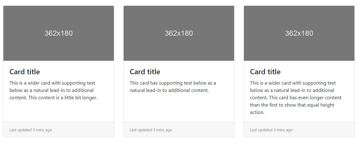
Which looks like this in my Opera browser: enter image description here

This is nothing like the example or what I described above.

See Question&Answers more detail:os

与恶龙缠斗过久,自身亦成为恶龙;凝视深渊过久,深渊将回以凝视…
thumb_up_alt 0 like thumb_down_alt 0 dislike
132 views
Welcome To Ask or Share your Answers For Others

1 Answer

The hidden-* and visible-* classes no longer exist in Bootstrap 4 Beta. Also replaced card-block with card-body. I think it will solve your problem.

<!DOCTYPE html>
<html lang="en">

  <head>

    <meta charset="utf-8">
    <meta name="viewport" content="width=device-width, initial-scale=1, shrink-to-fit=no">

    <link rel="stylesheet" href="https://maxcdn.bootstrapcdn.com/bootstrap/4.0.0-beta.2/css/bootstrap.min.css" integrity="sha384-PsH8R72JQ3SOdhVi3uxftmaW6Vc51MKb0q5P2rRUpPvrszuE4W1povHYgTpBfshb" crossorigin="anonymous">

    <script src="https://code.jquery.com/jquery-3.2.1.slim.min.js" integrity="sha384-KJ3o2DKtIkvYIK3UENzmM7KCkRr/rE9/Qpg6aAZGJwFDMVNA/GpGFF93hXpG5KkN" crossorigin="anonymous"></script>
    <script src="https://cdnjs.cloudflare.com/ajax/libs/popper.js/1.12.3/umd/popper.min.js" integrity="sha384-vFJXuSJphROIrBnz7yo7oB41mKfc8JzQZiCq4NCceLEaO4IHwicKwpJf9c9IpFgh" crossorigin="anonymous"></script>
    <script src="https://maxcdn.bootstrapcdn.com/bootstrap/4.0.0-beta.2/js/bootstrap.min.js" integrity="sha384-alpBpkh1PFOepccYVYDB4do5UnbKysX5WZXm3XxPqe5iKTfUKjNkCk9SaVuEZflJ" crossorigin="anonymous"></script>
    <script src="https://cdn.steemjs.com/lib/latest/steem.min.js"></script>


  </head>

  <body>
      <div class="container">
          <div class="card-deck">
              <div class="card mb-4">
                  <img class="card-img-top img-fluid" src="//placehold.it/500x280" alt="Card image cap">
                  <div class="card-body">
                      <h4 class="card-title">1 Card title</h4>
                      <p class="card-text">This is a longer card with supporting text below as a natural lead-in to additional content. This content is a little bit longer.</p>
                      <p class="card-text"><small class="text-muted">Last updated 3 mins ago</small></p>
                  </div>
              </div>
              <div class="card mb-4">
                  <img class="card-img-top img-fluid" src="//placehold.it/500x280" alt="Card image cap">
                  <div class="card-body">
                      <h4 class="card-title">2 Card title</h4>
                      <p class="card-text">This is a longer card with supporting text below as a natural lead-in to additional content. This content is a little bit longer.</p>
                      <p class="card-text"><small class="text-muted">Last updated 3 mins ago</small></p>
                  </div>
              </div>
              <div class="w-100 d-none d-sm-block d-md-none"><!-- wrap every 2 on sm--></div>
              <div class="card mb-4">
                  <img class="card-img-top img-fluid" src="//placehold.it/500x280" alt="Card image cap">
                  <div class="card-body">
                      <h4 class="card-title">3 Card title</h4>
                      <p class="card-text">This is a longer card with supporting text below as a natural lead-in to additional content. This content is a little bit longer.</p>
                      <p class="card-text"><small class="text-muted">Last updated 3 mins ago</small></p>
                  </div>
              </div>
              <div class="w-100 d-none d-md-block d-lg-none"><!-- wrap every 3 on md--></div>
              <div class="card mb-4">
                  <img class="card-img-top img-fluid" src="//placehold.it/500x280" alt="Card image cap">
                  <div class="card-body">
                      <h4 class="card-title">4 Card title</h4>
                      <p class="card-text">This is a longer card with supporting text below as a natural lead-in to additional content. This content is a little bit longer.</p>
                      <p class="card-text"><small class="text-muted">Last updated 3 mins ago</small></p>
                  </div>
              </div>
              <div class="w-100 d-none d-sm-block d-md-none"><!-- wrap every 2 on sm--></div>
              <div class="w-100 d-none d-lg-block d-xl-none"><!-- wrap every 4 on lg--></div>
              <div class="card mb-4">
                  <img class="card-img-top img-fluid" src="//placehold.it/500x280" alt="Card image cap">
                  <div class="card-body">
                      <h4 class="card-title">5 Card title</h4>
                      <p class="card-text">This is a longer card with supporting text below as a natural lead-in to additional content. This content is a little bit longer.</p>
                      <p class="card-text"><small class="text-muted">Last updated 3 mins ago</small></p>
                  </div>
              </div>
              <div class="w-100 d-none d-xl-block"><!-- wrap every 5 on xl--></div>
              <div class="card mb-4">
                  <img class="card-img-top img-fluid" src="//placehold.it/500x300" alt="Card image cap">
                  <div class="card-body">
                      <h4 class="card-title">6 Card title</h4>
                      <p class="card-text">This card has supporting text below as a natural lead-in to additional content.</p>
                      <p class="card-text"><small class="text-muted">Last updated 3 mins ago</small></p>
                  </div>
              </div>
              <div class="w-100 d-none d-sm-block d-md-none"><!-- wrap every 2 on sm--></div>
              <div class="w-100 d-none d-md-block d-lg-none"><!-- wrap every 3 on md--></div>
              <div class="card mb-4">
                  <img class="card-img-top img-fluid" src="//placehold.it/500x270" alt="Card image cap">
                  <div class="card-body">
                      <h4 class="card-title">7 Card title</h4>
                      <p class="card-text">This is a wider card with supporting text below as a natural lead-in to additional content. This card has even longer content than the first to show that equal height action.</p>
                      <p class="card-text"><small class="text-muted">Last updated 3 mins ago</small></p>
                  </div>
              </div>
              <div class="card mb-4">
                  <img class="card-img-top img-fluid" src="//placehold.it/500x300" alt="Card image cap">
                  <div class="card-body">
                      <h4 class="card-title">8 Card title</h4>
                      <p class="card-text">This card has supporting text below as a natural lead-in to additional content.</p>
                      <p class="card-text"><small class="text-muted">Last updated 3 mins ago</small></p>
                  </div>
              </div>
              <div class="w-100 d-none d-sm-block d-md-none"><!-- wrap every 2 on sm--></div>
              <div class="w-100 d-none d-lg-block d-xl-none"><!-- wrap every 4 on lg--></div>
              <div class="card mb-4">
                  <img class="card-img-top img-fluid" src="//placehold.it/500x270" alt="Card image cap">
                  <div class="card-body">
                      <h4 class="card-title">Card title</h4>
                      <p class="card-text">This is a wider card with supporting text below as a natural lead-in to additional content. This card has even longer content than the first to show that equal height action.</p>
                      <p class="card-text"><small class="text-muted">Last updated 3 mins ago</small></p>
                  </div>
              </div>
              <div class="w-100 d-none d-md-block d-lg-none"><!-- wrap every 3 on md--></div>
              <div class="card mb-4">
                  <img class="card-img-top img-fluid" src="//placehold.it/500x270" alt="Card image cap">
                  <div class="card-body">
                      <h4 class="card-title">10 Card title</h4>
                      <p class="card-text">This is a wider card with supporting text below as a natural lead-in to additional content. This card has even longer content than the first to show that equal height action.</p>
                      <p class="card-text"><small class="text-muted">Last updated 3 mins ago</small></p>
                  </div>
              </div>
          </div>

      </div>
  </body>

与恶龙缠斗过久,自身亦成为恶龙;凝视深渊过久,深渊将回以凝视…
thumb_up_alt 0 like thumb_down_alt 0 dislike
Welcome to ShenZhenJia Knowledge Sharing Community for programmer and developer-Open, Learning and Share
...