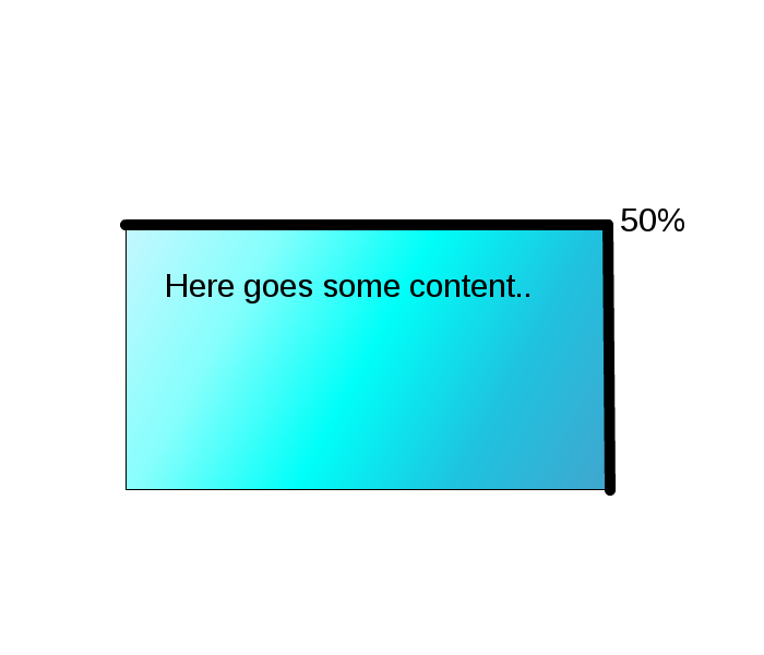
Welcome to ShenZhenJia Knowledge Sharing Community for programmer and developer-Open, Learning and Share
menu search
person
Welcome To Ask or Share your Answers For Others

Categories

I'm trying to figure out how to implement progressbar around rectangle. Let's image that I have div 500x300 with 5px (black) border.

I would like that progress bar started in left top corner then goes to -> right corner -> bottom - right corner -> left bottom corner -> and back on start point.

Progress bar around rectangle

See Question&Answers more detail:os

与恶龙缠斗过久,自身亦成为恶龙;凝视深渊过久,深渊将回以凝视…
thumb_up_alt 0 like thumb_down_alt 0 dislike
336 views
Welcome To Ask or Share your Answers For Others

1 Answer

Pure CSS:

This effect can be achieved with CSS using multiple linear gradients as background and positioning them appropriately. The approach is as follows:

  • Create 4 thin linear-gradient backgrounds for each border of the element. The thickness of the border determines the background-size. That is, if border thickness is 5px then the linear gradients that produce the top and bottom borders would be 100% 5px (100% width 5px height) whereas those that produce left and right borders would be 5px 100% (3px width 100% height).
  • Initially the background-position is set such that none of the borders would be visible. During animation we animate each of the background gradients into its correct position. This produces the effect of having an animated border.

I have used CSS keyframes in the below snippet and so it automatically animates from start to end (that is, it stops only after full border is painted) but if you wish to have more control over it (and say stop it midway as in a progress bar) then you could use JS and modify background-position based on the percentage of progress.

.progress {
  height: 300px;
  width: 500px;
  background: linear-gradient(to right, black 99.99%, transparent), linear-gradient(to bottom, black 99.99%, transparent), linear-gradient(to right, black 99.99%, transparent), linear-gradient(to bottom, black 99.99%, transparent);
  background-size: 100% 5px, 5px 100%, 100% 5px, 5px 100%;
  background-repeat: no-repeat;
  animation: progress 4s linear forwards;
  background-position: -500px 0px, 495px -300px, 500px 295px, 0px 300px;
}
@keyframes progress {
  0% {
    background-position: -500px 0px, 495px -300px, 500px 295px, 0px 300px;
  }
  25% {
    background-position: 0px 0px, 495px -300px, 500px 295px, 0px 300px;
  }
  50% {
    background-position: 0px 0px, 495px 0px, 500px 295px, 0px 300px;
  }
  75% {
    background-position: 0px 0px, 495px 0px, 0px 295px, 0px 300px;
  }
  100% {
    background-position: 0px 0px, 495px 0px, 0px 295px, 0px 0px;
  }
}
<!-- prefix free library is only to avoid browser prefixes -->
<script src="https://cdnjs.cloudflare.com/ajax/libs/prefixfree/1.0.7/prefixfree.min.js"></script>

<div class="progress"></div>

与恶龙缠斗过久,自身亦成为恶龙;凝视深渊过久,深渊将回以凝视…
thumb_up_alt 0 like thumb_down_alt 0 dislike
Welcome to ShenZhenJia Knowledge Sharing Community for programmer and developer-Open, Learning and Share
...