Responsive Web design (RWD) is a Web design approach aimed at crafting sites to provide an optimal viewing experience
When you design your responsive website you should consider the size of the screen and not the device type. The media queries helps you do that.
If you want to style your site per device, you can use the user agent value, but this is not recommended since you'll have to work hard to maintain your code for new devices, new browsers, browsers versions etc while when using the screen size, all of this does not matter.
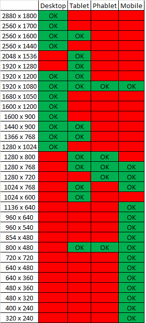
You can see some standard resolutions in this link.
BUT, in my opinion, you should first design your website layout, and only then adjust it with media queries to fit possible screen sizes.
Why? As I said before, the screen resolutions variety is big and if you'll design a mobile version that is targeted to 320px your site won't be optimized to 350px screens or 400px screens.
TIPS
- When designing a responsive page, open it in your desktop browser and change the width of the browser to see how the width of the screen affects your layout and style.
- Use percentage instead of pixels, it will make your work easier.
Example
I have a table with 5 columns. The data looks good when the screen size is bigger than 600px so I add a breakpoint at 600px and hides 1 less important column when the screen size is smaller. Devices with big screens such as desktops and tablets will display all the data, while mobile phones with small screens will display part of the data.
State of mind
Not directly related to the question but important aspect in responsive design.
Responsive design also relate to the fact that the user have a different state of mind when using a mobile phone or a desktop. For example, when you open your bank's site in the evening and check your stocks you want as much data on the screen. When you open the same page in the your lunch break your probably want to see few important details and not all the graphs of last year.
与恶龙缠斗过久,自身亦成为恶龙;凝视深渊过久,深渊将回以凝视…