Welcome to ShenZhenJia Knowledge Sharing Community for programmer and developer-Open, Learning and Share
menu search
person
Welcome To Ask or Share your Answers For Others

Categories

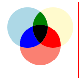
Maybe there's not a way, but I'm looking to create 3 circles that would appear to overlap, yet would be actually individual objects with pure css. I can easily create a crescent moon shape, but I also need this object to only be reactive to the actual colored object, not the border as well.

I need to make something like this:

enter image description here

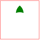
And to show you more of what I mean, each object needs to be it's own shape like this: enter image description here

Really prefer css if possible. SVG could be another way, but again, I need each object to react to the visible object on hover/click and NOT outside it's visible area.

See Question&Answers more detail:os

与恶龙缠斗过久,自身亦成为恶龙;凝视深渊过久,深渊将回以凝视…
thumb_up_alt 0 like thumb_down_alt 0 dislike
305 views
Welcome To Ask or Share your Answers For Others

1 Answer

Making the shapes really concaves in CSS is really hard, in this case your best bet would be SVG.

But, if you want a pure CSS solution, may be you don't need really those shapes. If you set your z-index ok, then you can get your topmost div to hide the others, and then you don't care about the concave side ...

In this demo, the hover works ok. It would be the same for other events.

div {
  width: 240px;
  height: 240px;
  position: absolute;
  border-radius: 50%;
}

.innerw {
  left: 0px;
  top: 0px;
  overflow: hidden;
}

.innerw2 {
  left: 170px;
  top: 0px;
  overflow: hidden;
}

.inner {
  left: -85px;
  top: 130px;
  background-color: palegreen;
  z-index: 20;
}

.inner:hover {
  background-color: green;
}

#midw1 {
  left: 0px;
  top: 0px;
  overflow: hidden;
}
#mid1 {
  left: 170px;
  top: 0px;
}
#midw2 {
  left: 0px;
  top: 0px;
  overflow: hidden;
}
#mid2 {
  left: 85px;
  top: 130px;
}
#midw3 {
  left: 170px;
  top: 0px;
  overflow: hidden;
}
#mid3 {
  left: -85px;
  top: 130px;
}
.mid {
  background-color: lightblue;
  z-index: 15;
}
.mid:hover {
  background-color: blue;
}


#outer1 {
  left: 0px;
  top: 0px;
}

#outer2 {
  left: 170px;
  top: 0px;
}
#outer3 {
  left: 85px;
  top: 130px;
}
.outer {
  background-color: lightcoral;
  z-index: 10;
}
.outer:hover {
  background-color: red;
}
<div id="outer1" class="outer">
</div>
<div id="outer2" class="outer">
</div>
<div id="outer3" class="outer">
</div>
<div id="midw1">
<div id="mid1" class="mid"></div>
</div>
<div id="midw2">
<div id="mid2" class="mid"></div>
</div>
<div id="midw3">
<div id="mid3" class="mid"></div>
</div>
<div class="innerw">
<div class="innerw2">
<div class="inner">
</div>
</div>
</div>

与恶龙缠斗过久,自身亦成为恶龙;凝视深渊过久,深渊将回以凝视…
thumb_up_alt 0 like thumb_down_alt 0 dislike
Welcome to ShenZhenJia Knowledge Sharing Community for programmer and developer-Open, Learning and Share
...